Beiersdorf has been synonymous with innovative skin care since 1882. The Beiersdorf Campus, its new company headquarters in the heart of Hamburg, stands for interdisciplinary collaboration, innovation and the continued expansion of the company. We were asked to develop an effective wayfinding system to optimise the spatial experience at the new headquarters, in addition to our design of the work worlds and gastronomic offerings.
![[Translate to English:] Beiersdorf AG Beiersdorf Campus: Wayfinding l1](https://ifgroupt3-bucket.s3.amazonaws.com/_processed_/3/c/csm_1460_Beiersdorf-Campus_Philip_Kottlorz-_1_-24_402898bb2b.jpg "[Translate to English:]")
![[Translate to English:] Beiersdorf AG Beiersdorf Campus: Wayfinding The way we C.A.R.E.+](https://ifgroupt3-bucket.s3.amazonaws.com/_processed_/e/2/csm_1460_Beiersdorf-Wayfinding_Grafiken_02_Test_1e10d0cfe3.jpg "[Translate to English:]")
The way we C.A.R.E.+
Beiersdorf’s employees were actively involved in the design of the new corporate headquarters from the very start – as well as in the naming of the buildings. The winning concept – THE WAY WE C.A.R.E. – is firmly rooted in Beiersdorf’s corporate strategy and values. It supports a sense of belonging and provides orientation for employees and visitors alike. The campus is composed of the following buildings: C.ONNECT, A.CTION, R.OOTS, E.MPOWER, X.PLORE (the latter is still under construction). C.ONNECT forms the centrepiece of the campus and serves as a bridge to the other buildings. It is the place where cooperation and innovation take centre stage, and this is where our guidance system was implemented.
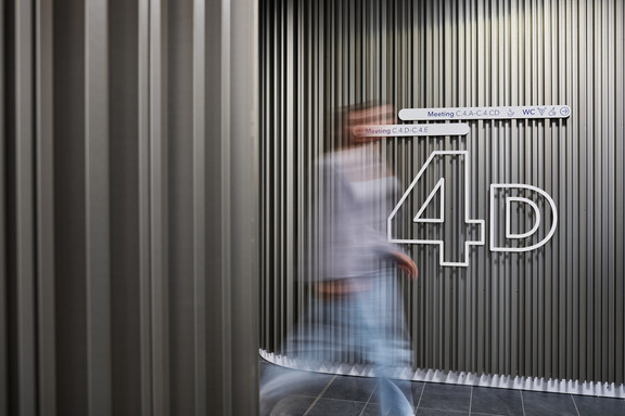
The narrow, elongated building with its transverse wings required a clear system for labelling the different rooms and work areas. Our main priority was to ensure that everyone can find their way around intuitively and without hesitation. Starting at the main entrance, the letters A to E are assigned to the main segments, while the names of the intermediate segments are derived from their relationship to the main segments (AB, BC, etc.). The floors are numbered conventionally (from -2 to 6).


Movemeet
The basic tenet of agile working is positively supported by our guidance system: Flexible, functional working in different work modes is best possible when the range of options is embedded in a clear structure. Corridors function as a place where people, thoughts and ideas can meet and move around.
![[Translate to English:] Beiersdorf AG Beiersdorf Campus: Wayfinding Movemeet](https://ifgroupt3-bucket.s3.amazonaws.com/_processed_/4/0/csm_1460_Beiersdorf-Campus_Philip_Kottlorz-52_3bff858a8a.jpg "[Translate to English:]")

The orientation signs with their rounded corners pick up on the dynamics of the space. Pictograms designed by Studio BR, which act as a universal language to guide the way, emphasise Beiersdorf’s pioneering role in New Work and diversity. On the white storey panels, a small sign with a blue marker shows your current position. The panels give the impression of floating against the wall and of being as light and transparent as the architecture of the building.


![[Translate to English:] Beiersdorf AG Beiersdorf Campus: Wayfinding l6 1](https://ifgroupt3-bucket.s3.amazonaws.com/_processed_/0/9/csm_1460_Beiersdorf-Campus_Philip_Kottlorz-_1_-5_0f57b5b932.jpg "[Translate to English:]")
![[Translate to English:] Beiersdorf AG Beiersdorf Campus: Wayfinding l6 2](https://ifgroupt3-bucket.s3.amazonaws.com/_processed_/6/0/csm_1460_Beiersdorf-Campus_Philip_Kottlorz-0128_c8ce24087a.jpg "[Translate to English:]")

A blue ribbon as the common thread
There are two sign types for different levels of information in C.ONNECT: white signs and blue signs. The blue signs lead to locations where the brand is emphasised and to superordinate administrative areas. The white signs, in contrast, show floor numbers and room names, as well as specific services or room functions, thereby helping users find their way around.
On the second floor, the Collaboration Hub, and on the office floors above, a blue ribbon snakes elegantly along the walkways, becoming the distinguishing feature or common thread in the signage system. The blue ribbon is designed in such a way that place markers can be changed and adapted if departments move. Both the interior design and the signage system are fully adapted to a dynamic work environment and equipped to react accordingly to future change processes.
![[Translate to English:] Beiersdorf AG Beiersdorf Campus: Wayfinding l7 2](https://ifgroupt3-bucket.s3.amazonaws.com/_processed_/a/3/csm_1460_Beiersdorf-Campus_Philip_Kottlorz-0251_da74b80d58.jpg "[Translate to English:]")
![[Translate to English:] Beiersdorf AG Beiersdorf Campus: Wayfinding l7 3](https://ifgroupt3-bucket.s3.amazonaws.com/_processed_/4/5/csm_1460_Beiersdorf-Campus_Philip_Kottlorz_DSC01416_8640f5a18f.jpg "[Translate to English:]")
Building a bigger picture – dot by dot
Different patterns of dots are applied to the floor. The signage system thus picks up on the shapes and elements of the interior design: Dotted and circular shapes can be found throughout the building, for example in the alcoves, the oblong niches, the acoustic panels and furniture. The dots provide graphical zoning and establish connections between corridors and room sections. In this way a visual flow is created as you walk past. Dots connect to form lines, symbolising movement, agility and the big picture: Connecting the dots one step at a time.

![[Translate to English:] Beiersdorf AG Beiersdorf Campus: Wayfinding Building a bigger picture – dot by dot2](https://ifgroupt3-bucket.s3.amazonaws.com/_processed_/6/c/csm_1460_Beiersdorf-Campus_Philip_Kottlorz-8_7089b39efc.jpg "[Translate to English:]")
![[Translate to English:] Beiersdorf AG Beiersdorf Campus: Wayfinding l8 1](https://ifgroupt3-bucket.s3.amazonaws.com/_processed_/1/4/csm_1460_Beiersdorf-Campus_Philip_Kottlorz-0127_b937dc92c1.jpg "[Translate to English:]")

![[Translate to English:] Beiersdorf AG Beiersdorf Campus: Wayfinding l8 3](https://ifgroupt3-bucket.s3.amazonaws.com/_processed_/e/c/csm_1460_Beiersdorf-Campus_Philip_Kottlorz-_1_-6_d642941f7d.jpg "[Translate to English:]")
![[Translate to English:] Beiersdorf AG Beiersdorf Campus: Wayfinding l9](https://ifgroupt3-bucket.s3.amazonaws.com/_processed_/5/1/csm_1460_Beiersdorf-Campus_Philip_Kottlorz-_1_-19_1f64a80ec6.jpg "[Translate to English:]")


